Fans mock NBA, ABC for putting ‘CGI’ trophies on Finals court
When fans tuned in for Game 2 of the 2025 NBA Finals, they expected high-stakes basketball, buzzer-beaters, and drama—not a laughable digital trophy floating around the court. Yet that’s exactly what they got. After backlash from Game 1’s “plain” court, ABC and the NBA tried to fix things by overlaying CGI Larry O’Brien trophies and Finals logos during the broadcast. It backfired.
Instead of enhancing the atmosphere, the low-res graphics glitched, disappeared mid-game, and were met with mass ridicule online. Within minutes, fans flooded social media with screenshots and sarcastic comments. What was meant to look grand ended up looking like a failed attempt at a 2008 video game update. Even Commissioner Adam Silver admitted the league may have gone too far—and hinted a return to old-school visuals could be coming.
Why Fans Are Roasting the League
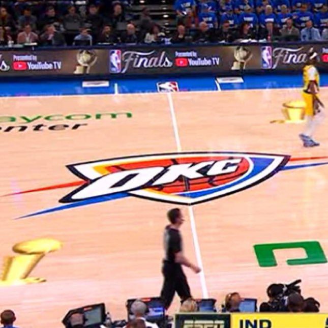
Let’s rewind. During Game 1 between the Oklahoma City Thunder and Indiana Pacers, fans noticed something odd: the court was missing its usual Finals flair. There were no logos, no championship markings—just a generic hardwood floor. Viewers on X (formerly Twitter) instantly called it out. “Looks like a regular season game,” one user posted. “Where’s the Finals energy?”
So for Game 2, ABC’s broadcast team tried a quick fix. Digital overlays of the Larry O’Brien trophy and a small Finals logo were placed near the scorers’ table and baseline. But the CGI looked pixelated, faded in and out during transitions, and sometimes disappeared entirely. Worse, in some clips, the digital logos were layered incorrectly—one clip even showed the trophy floating under a fan’s jersey or behind a coach’s foot.
That sent NBA Twitter into overdrive.
One fan posted, “Adam Silver said ‘here damn’ and gave us the worst CGI trophy in history.” Another joked, “These look like early PlayStation graphics.” Sportswriter Mike Beauvais shared, “The logos are terribly low-res and disappear if the camera moves too fast. This is hilarious.” Many compared it to the NFL or MLB, both of which still use vibrant, physical field designs for their big games—making the NBA’s choice look cheap by comparison.
Others pointed out that it wasn’t the first time the NBA had leaned too hard into digital graphics. Virtual ads and broadcast overlays have increased year after year, but never had they tried to CGI the very identity of the Finals onto the floor.
But to be fair, this move wasn’t just about being lazy. There’s a reason the league has stopped painting physical Finals logos on the court since 2020: safety. According to insiders, those decals can become slippery, especially under sweat or moisture, posing injury risks to players. That’s what pushed the league to experiment with digital logos in the first place.
Still, that explanation didn’t save the league from the mockery.
The backlash was so loud that even NBA Commissioner Adam Silver addressed it publicly at a community event in Oklahoma City. Speaking with reporters, Silver acknowledged the reaction and shared his own feelings: “I miss the way it used to look… It’s nice when you’re looking back on highlights, and there’s that trophy logo—you instantly know it was a special moment.”
He hinted that the league was reconsidering the decision, suggesting a full visual overhaul might be in the works as early as next season. “We’re going to look at it again,” he said. “There are ways to make the court feel special without compromising safety.”
Another report from Times of India quoted Silver saying the iconic Larry O’Brien logo might officially return to Finals courts in 2026, either as a safer physical decal or an improved high-resolution overlay. That small statement has sparked hope among fans who feel something special has been missing from the NBA’s biggest stage.
This Isn’t Just About Graphics — It’s About Tradition
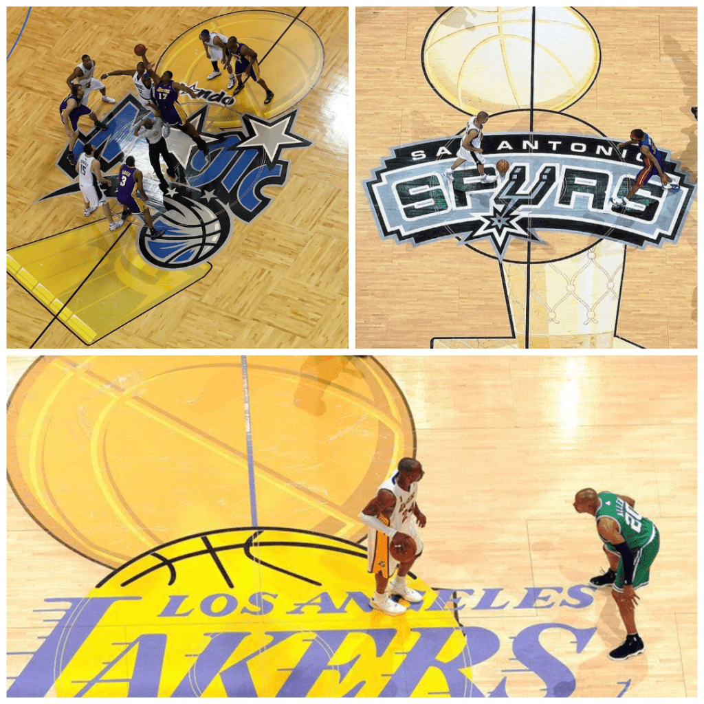
The Finals court used to be sacred. Whether it was the bold gold trophy at center court, the “NBA Finals” script splashed across the baseline, or the crisp red-white-blue logo, you knew you were watching something big. Take a look at highlight reels from Kobe’s championships or LeBron’s Miami Heat era—those visuals stuck with fans.
So when those elements disappear, even if for safety or broadcast tech reasons, it takes something away from the moment. The Finals lose a piece of their identity. Fans want drama, yes—but they also want the stage to look like it matters. A game-winning three-pointer means more when it’s taken on a floor that screams “This is the Finals.”
This season’s court—plain in Game 1, awkward in Game 2—just didn’t deliver.
From a branding perspective, this mishap also cost the league some credibility. The NBA is known for polished presentation, but this time, the CGI was glitchy, unrefined, and clearly rushed. Critics also suspect part of the shift toward digital overlays is to squeeze in extra sponsorships. The “YouTube TV” logo felt more prominent than the Finals branding itself. As one tweet joked, “At this point, it’s the YouTube TV Finals, not the NBA Finals.”
If the league truly wants to restore its image, it may have to embrace what made it iconic in the first place: physical presence, memorable visuals, and emotional weight. That means more than just fixing a few graphics—it’s about understanding what makes the Finals feel like the Finals.